
The Shutter Trap
Why Instagram Instants is a Masterclass in Platform Scale and a Nightmare for Human Psychology

Three days ago, Instagram deployed its newest feature, ‘Instants,’ globally. To the tech press, it’s a frictionless, zero-latency Snapchat clone. But look closer and the design is something far more calculating: a brilliantly engineered attention trap designed to bypass your better judgment and turn every moment into a slot machine.
If you’ve opened Instagram in the last 72 hours, you’ve likely noticed the shifts. With Instants, you’re no longer greeted by the familiar workflow of Capture -> Review -> Edit -> Filter -> Share. Instead, you are looking at a live trigger.
The core mechanics are deceptively simple:
No editing: Photos must be taken live within the app. No camera roll, no filters, no second-guessing.
No review: The moment your finger leaves the shutter, it’s already sending.
No permanence: The photo lands in the direct message section and vanishes in 24 hours from your screen, at least.
The Most Calculating Decision Isn’t the Speed
The most calculating product decision isn’t the instant delivery. It’s what you don’t see after you post. Unlike traditional Instagram Stories, Instants doesn’t show you who viewed your photo. No names, no counts, no faces.
That wasn’t an oversight. It was a deliberate choice.
When you share an unedited, real-time moment of your life, you instinctively want to know how many people saw it. Not just how many, but who. By removing that, Instagram leaves that question permanently open.
“Did THEY see it?”
“Why haven’t THEY responded?”
“Maybe I shouldn’t have posted this.”
So, the next time you feel that urge to check back ten minutes after posting, notice it. That’s not curiosity. That’s the loop working exactly as designed.
The question is whether anyone designed it that way deliberately, or whether it’s just what happens when a platform optimizes hard enough for engagement.

Why Meta Actually Built This
It sounds dystopian, but inside Meta’s product teams, this probably isn’t malice, it’s math.
The problem they were solving is straightforward. Polished, curated feeds make people anxious about posting. So they stop posting publicly and retreat to Snapchat, or private apps like BeReal, taking their daily habits and their data somewhere else. Instants is Meta’s answer to that migration. Strip away the editing, make sharing feel low-stakes, and pull that high-frequency, casual interaction back into Instagram’s own messaging system.
The no-camera-roll rule isn’t just an infrastructure decision because Meta already processes billions of gallery uploads a day through Stories and Reels. It serves a dual purpose:
Culturally, it acts as a guardrail against overthinking. Block the gallery and you block the spiral of selecting, editing, and second-guessing before you share.
Technically, live capture simplifies the media pipeline: standardized assets, lower processing overhead, and faster transmission from capture to delivery. This is why the experience feels instantaneous even across two billion devices.
The 24-hour disappearing window serves the same logic. While the content vanishes from the recipient’s view the moment they open it, the image is quietly routed to a private archive on your account. It is stored for up to a year, available for Meta to surface later as “Story Recaps.”
It feels ephemeral. It isn’t.
The Flaw They Shipped With
The backlash was immediate. Within hours of launch, users on X and Instagram were posting tutorials on how to hide the feature, panicking about accidental captures already sent to the wrong people.
This is a solvable problem, and the solution is simpler than you’d think.
A half-second delay. That’s it. When you lift your finger off the shutter, the photo doesn’t send instantly. It waits 500 milliseconds before transmitting. Half a second is too fast to notice under normal circumstances, but just long enough to hit Undo if your stomach drops the moment after you shoot. No accidental send ever reaches the recipient. No cleanup required on Meta’s end.
They didn’t ship it that way. The question is why.
The Cold Incentives
To truly evaluate the trade-offs of this feature, look at the cold mechanical incentives driving growth engineering teams. Product decisions at this scale are a balancing act between user experience, infrastructure costs, and system security:
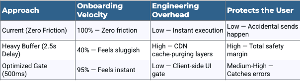
The math shows why the current implementation won. Growth engineering is rarely about building a flawless, error-proof experience for the user. It is about finding the maximum possible speed the architecture can handle right up until the moment users stop trusting it enough to keep posting.
The Platform Paradox
The real takeaway here isn’t about a missing half-second button. It is about a fundamental product management paradox: maximizing transaction velocity almost always requires exploiting human impulsivity.
A safety grace period activates your rational brain. It gives you time to think, second-guess, and cancel an interaction. But platforms like Instagram rely on split-second panic to create the volatile, high-frequency social loops that keep metrics spiked. To a growth team, user friction isn’t a bug to be fixed; it is a variable to be tuned.
That is the true architecture of the attention economy. The next time an application forces you to act before you think, look past the clean interface. The system is working exactly as designed.
Building Durable Systems
I love tearing apart software because I love building systems that balance high-scale platform complexity with rock-solid user trust. I specialize in scaling core infrastructures, developer velocity tools, and complex system design.
I’m currently wrapping up a deliberate career sabbatical and am actively looking for my next Product Management challenge. If your team is scaling heavy infrastructure, managing complex platform loops, or building tools that developer ecosystems rely on, let’s talk.
Connect with me on LinkedIn or drop a comment below.